Blog
Archive for the ‘Client’ Category
Empress Hotel wrapped up
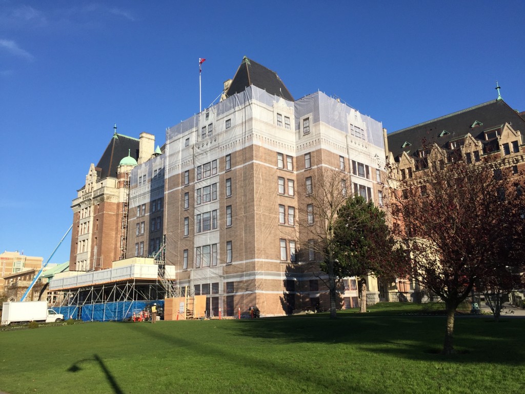
The Empress Hotel is in the process of being wrapped in a 46,000 square foot image we created for the Victoria landmark. The image is a composite of high resolution photos by Sama Jim Canzian and 3D renders by Kevin House. The wrap consists of 46 panels of mesh (each 100 feet high) which wrap around the front and sides of Sir Francis Rattenbury’s original 1908 building. Here are a few photos of the installation in progress. Restoration work is being done to the exterior between now and spring 2016. More photos and a case study of the creation of the gigantic image to follow.
Logo Design Questionnaire
Let’s learn about your business
A logo can make your business memorable and unique. In order for me to design an awesome logo for you, I first need to learn as much as possible about your business, target audience, vision and anything else that might be related. Your likes and dislikes can help us move quickly in the right direction.
Pay Your Age at Dance Victoria
Dance Victoria’s Pay Your Age Program is designed to make dance performance tickets accessible for 12-29 year old patrons.
The Seghers Collection book
We completed the first in a planned series of titles for University of Victoria Libraries Special Collections. The Seghers Collection: Old Books for a New World is an exploration of the books that belonged to Charles John Seghers (1839–1886), the second Roman Catholic bishop of Victoria. Seghers was a bibliophile who always carried books with him when he travelled, and he acquired a remarkable collection of ancient books in nine European languages. As Seghers told a friend, “a bishop without books is a soldier without arms.”
Fringe illustration honoured

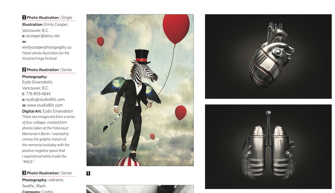
Congratulations to Emily Cooper, whose charming photo illustration for the 2012 Victoria Fringe Festival poster was recognized in the latest Applied Arts annual awards issue. The Vancouver artist and photographer has created award-winning work for the Shaw Festival, Theatre Calgary and Pacific Opera Victoria.
Check out Emily’s portfolio at EmilyCooperPhotography.ca
Renovating Web sites
If your Web site was built more than three years ago, it’s probably time to renovate. Web technologies are constantly changing and sites need to be adapted to different environments that didn’t exist just a few years back. Many older sites don’t play very well with smartphones and tablets (or even laptops). If you haven’t yet, you owe it to yourself to view your existing site on a tablet such as the iPad: you may be surprised to find important elements are not functioning, are displaying badly — even missing outright — due to software and/or hardware incompatibilities. If your site has Flash on it, no one on an iPhone or iPad can use that part of your site.
Cook Street Liquor logo refresh
We just completed a refresh of Cook Street Liquor’s logo. Earlier this year our favourite shop for beer and whiskey dropped ‘Village’ from its name so it was time for an update, but the owner also wanted to find a way to personalize the logo for different markets — branding that emphasized their great craft beer selection for music audiences at the Rifflandia festival, for instance, and something that trumpeted their specialty wines in glossy magazines.
One of the challenges was working with the existing wordmark — the client wanted to keep the same typeface and basic layout so that retail signage could be retained — but at the same time modernize a bit and make the logo stronger. We suggested creating a logo family with a strong central element that remains unchanged, set into two different badges like this: the client can pick the logo depending on their target audience.


