Portfolio
- Portfolio List
- Portfolio Detail
Munro’s Books brand refresh
Highlights, Newest, Print, Stationery, Branding, Environmental

Munro's Books
Challenge
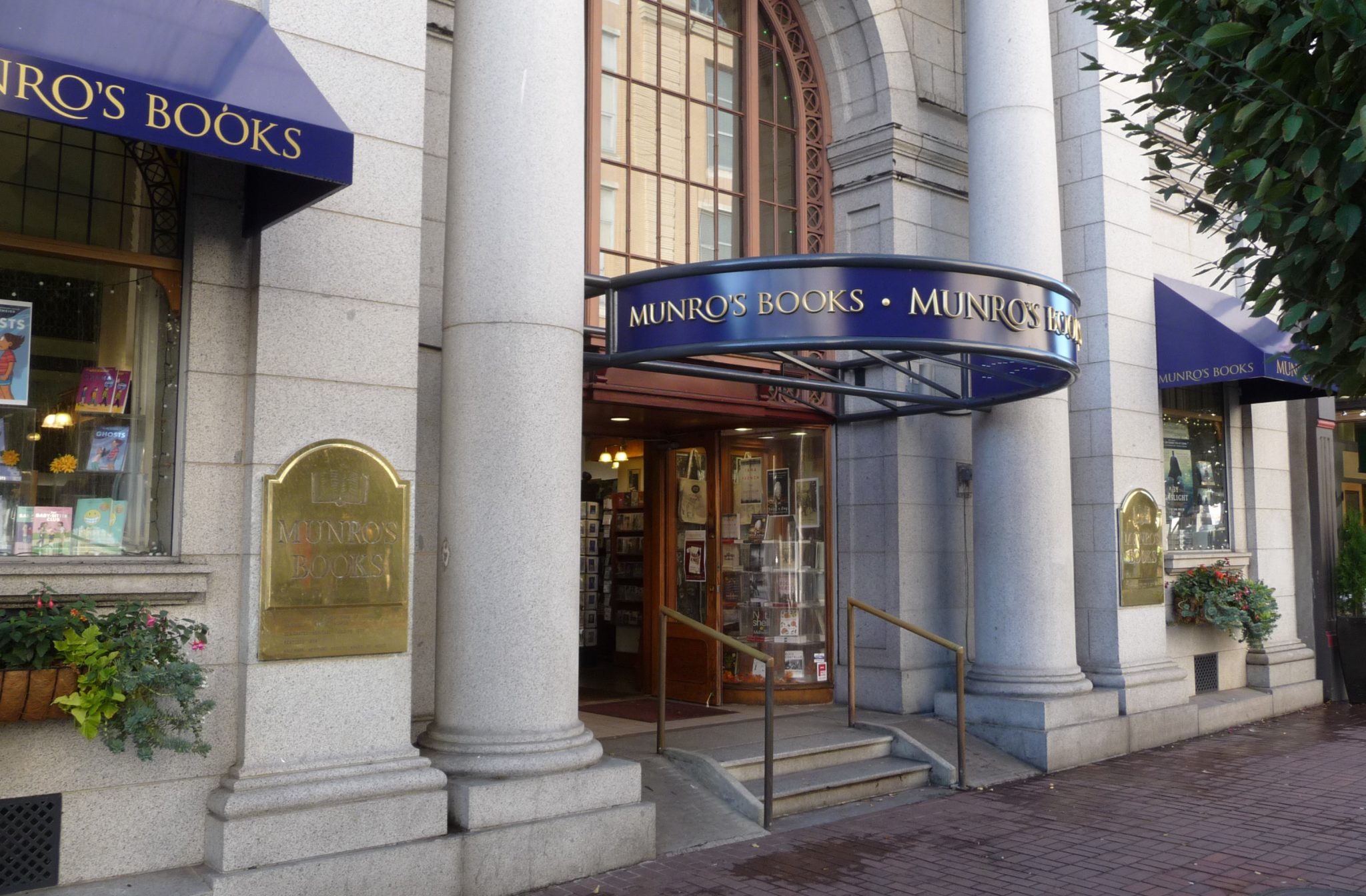
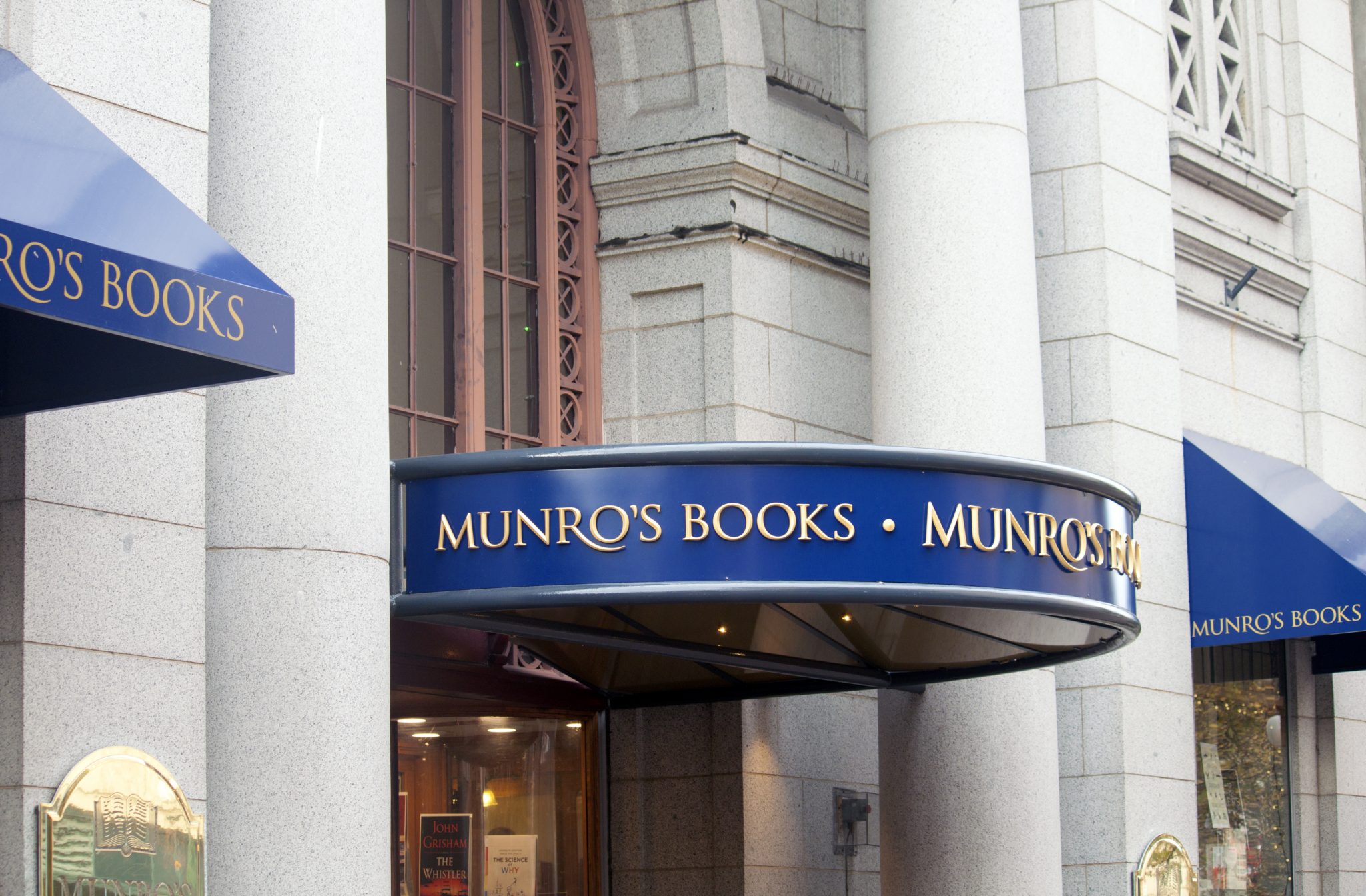
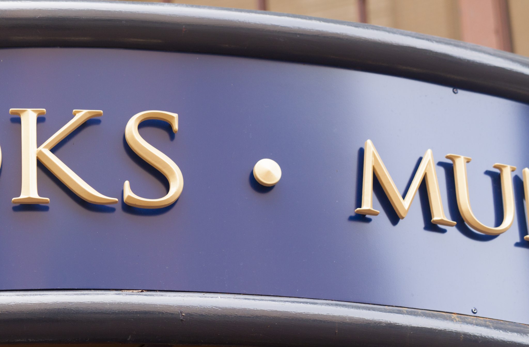
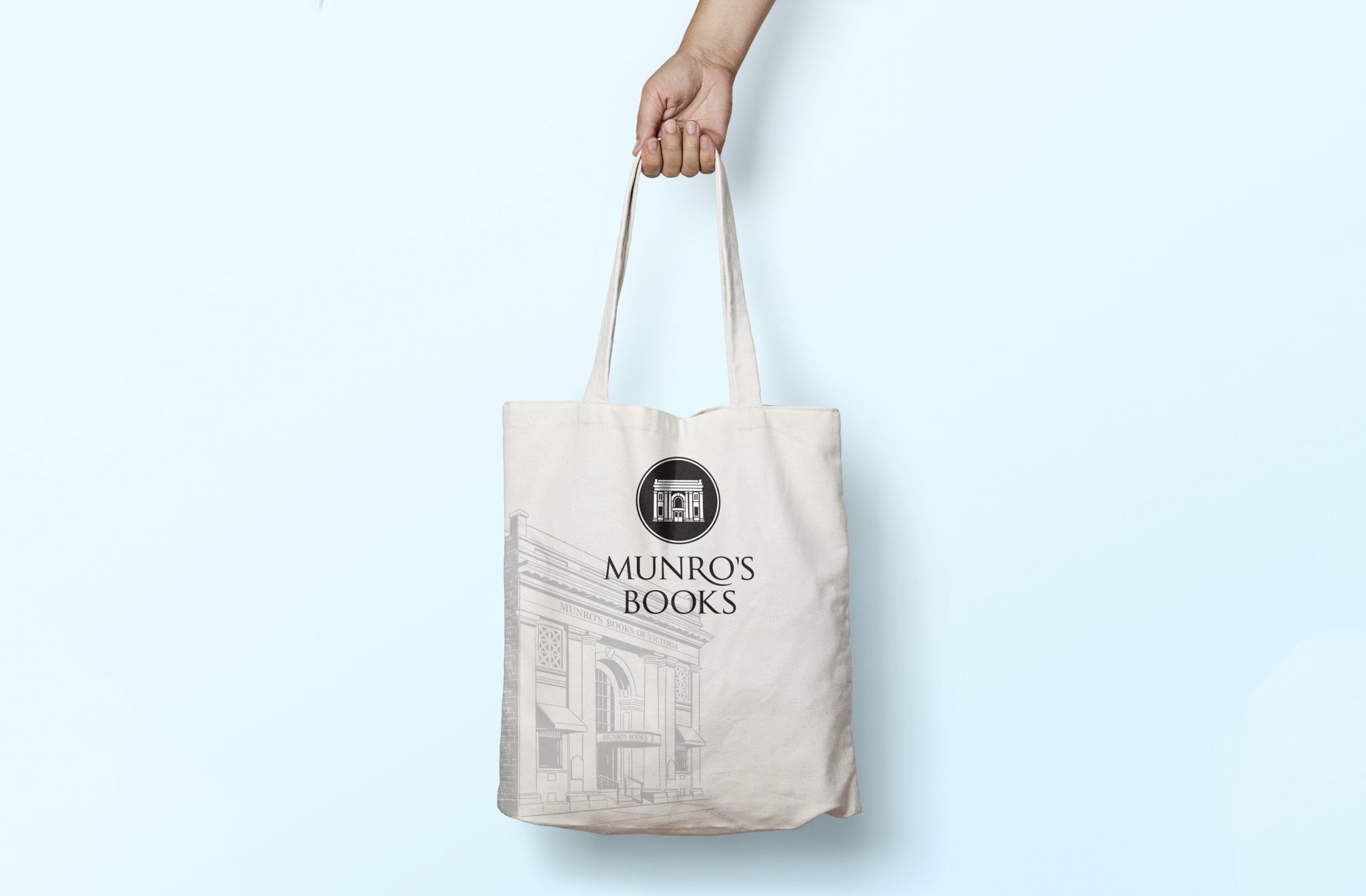
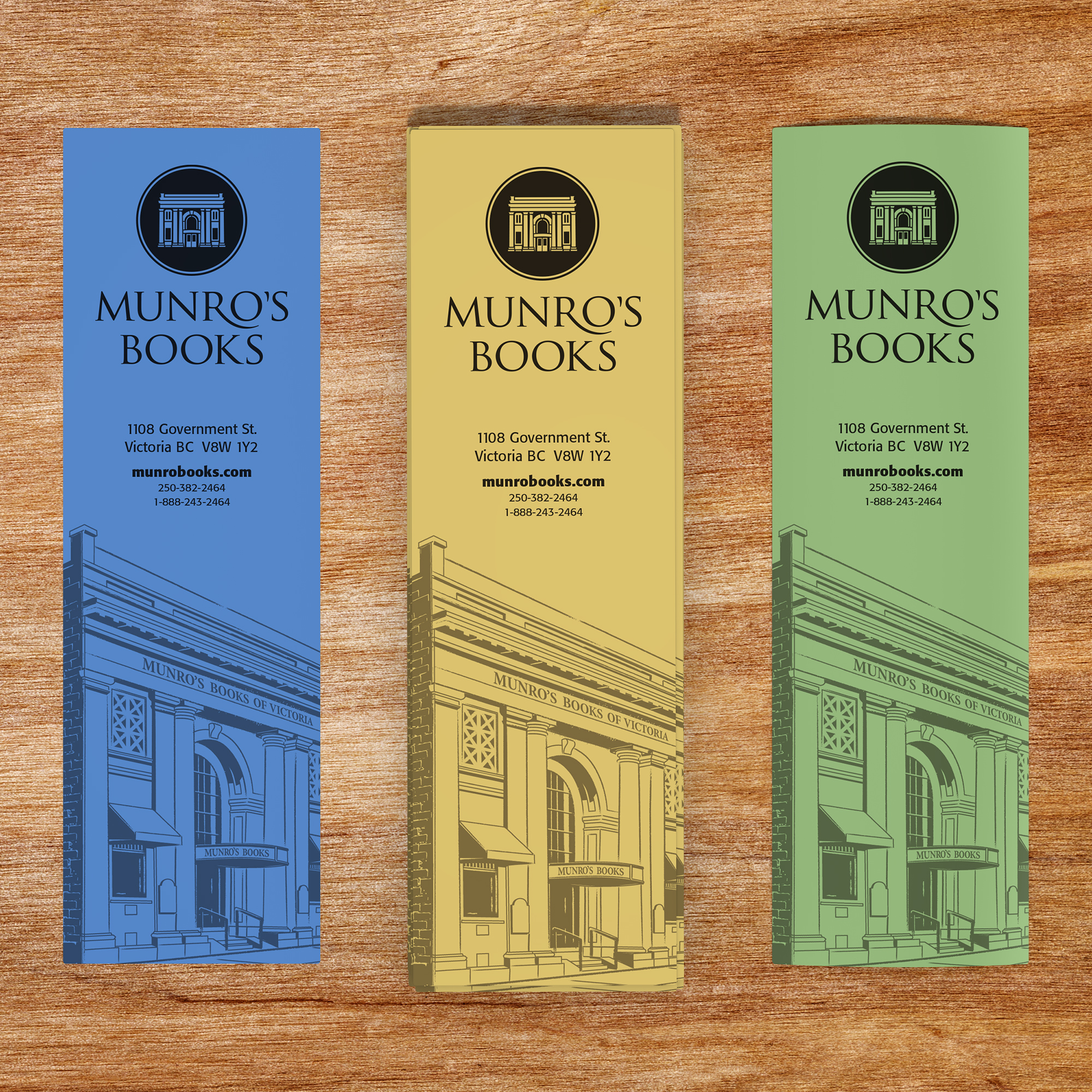
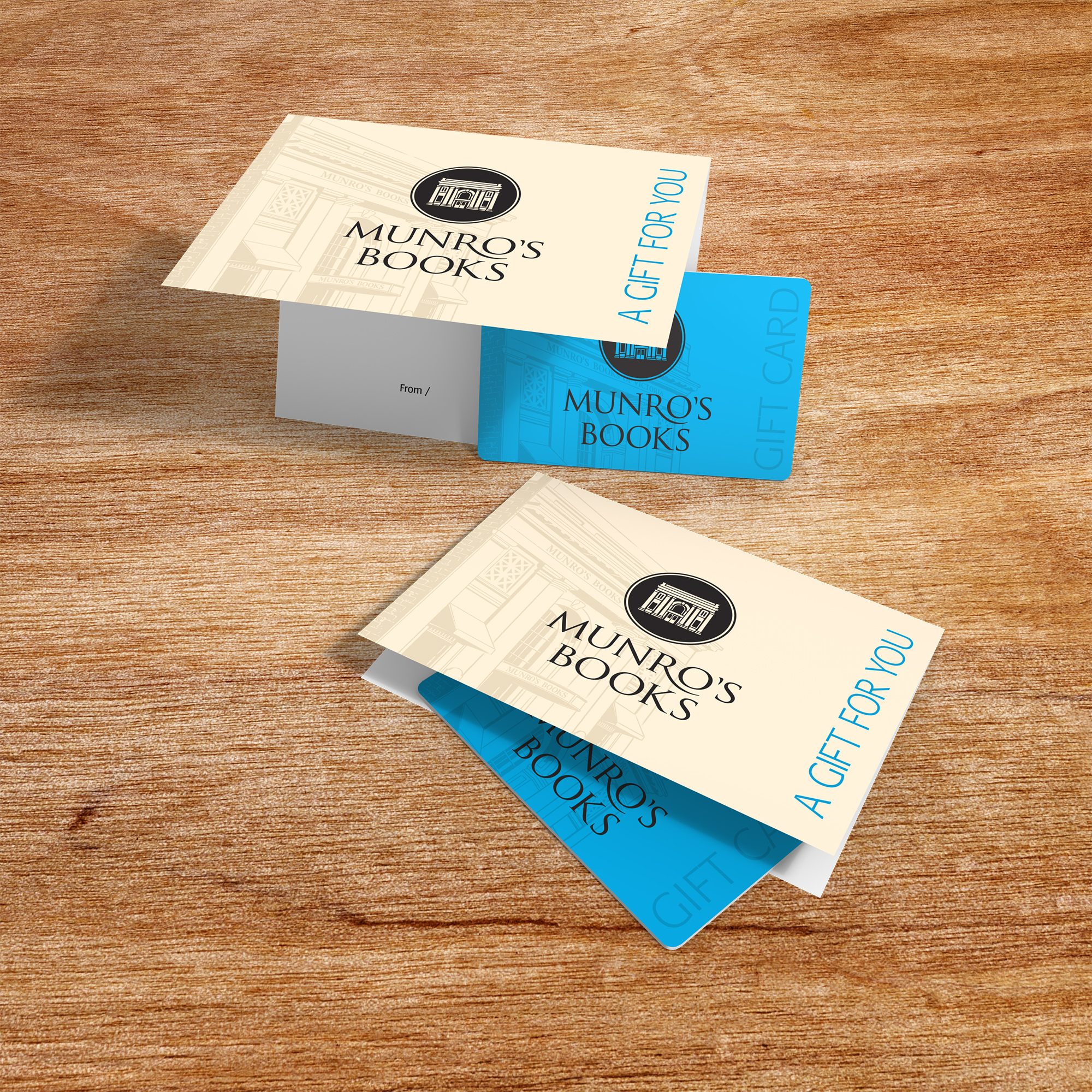
Munro's Books asked us to refresh the landmark store’s visual identity, with a brief to create a strong, easily-identifiable and easy-to-reproduce logo in place of the grab bag of images and text then in use by staff. At the same time that the new owners wanted to modernize and bring consistency to their visual identity, they didn't want to alienate their loyal customer base by introducing a radically different look and feel not in keeping with the heritage of their brand in the community. We used a circle and inset a bold, stylized drawing of the building façade for the icon, referring back to the original illustration, in use for many years in marketing materials but terrible to reproduce or work with. The type used in the wordmark makes reference to classical Roman Capital letterforms (and nods to the store's name carved into stone above the entranceway).
Collaborators
Kevin House (illustrator)
Location
Victoria, BC Canada
Comments
The identity was applied to promotional items, exterior signage and a new Web site in 2016; in-store signage will be redesigned with the new branding in 2017.
The owners, staff and customers have all embraced the new branding. Canvas tote bags featuring the new identity are outselling all other book bags in-store, creating a new revenue stream for the business. The brand-new Web site has led to dramatically-increased online sales and orders.