Portfolio
- Portfolio List
- Portfolio Detail
Cook Street Liquor logo refresh
Newest, Branding, Environmental
Challenge
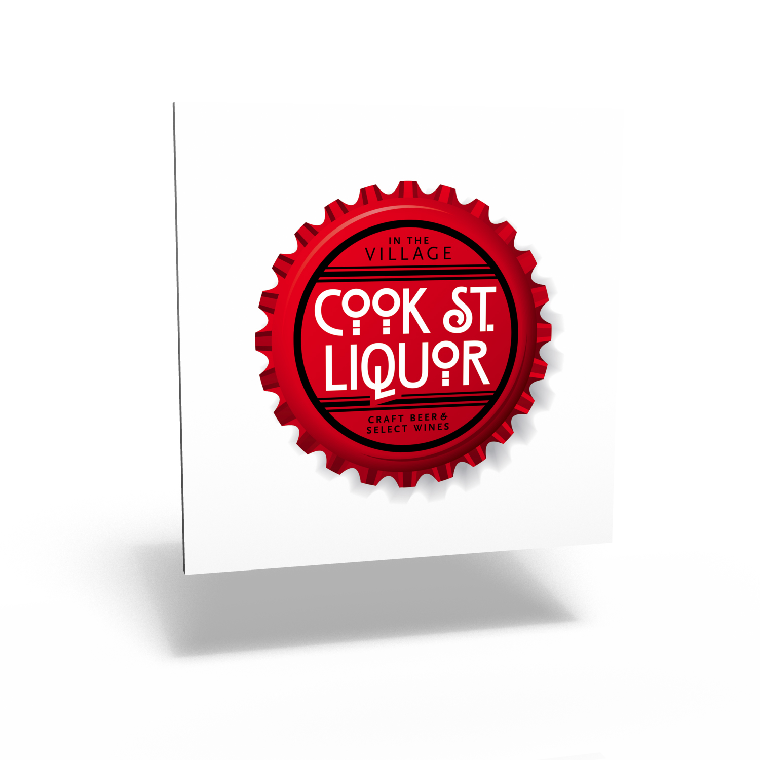
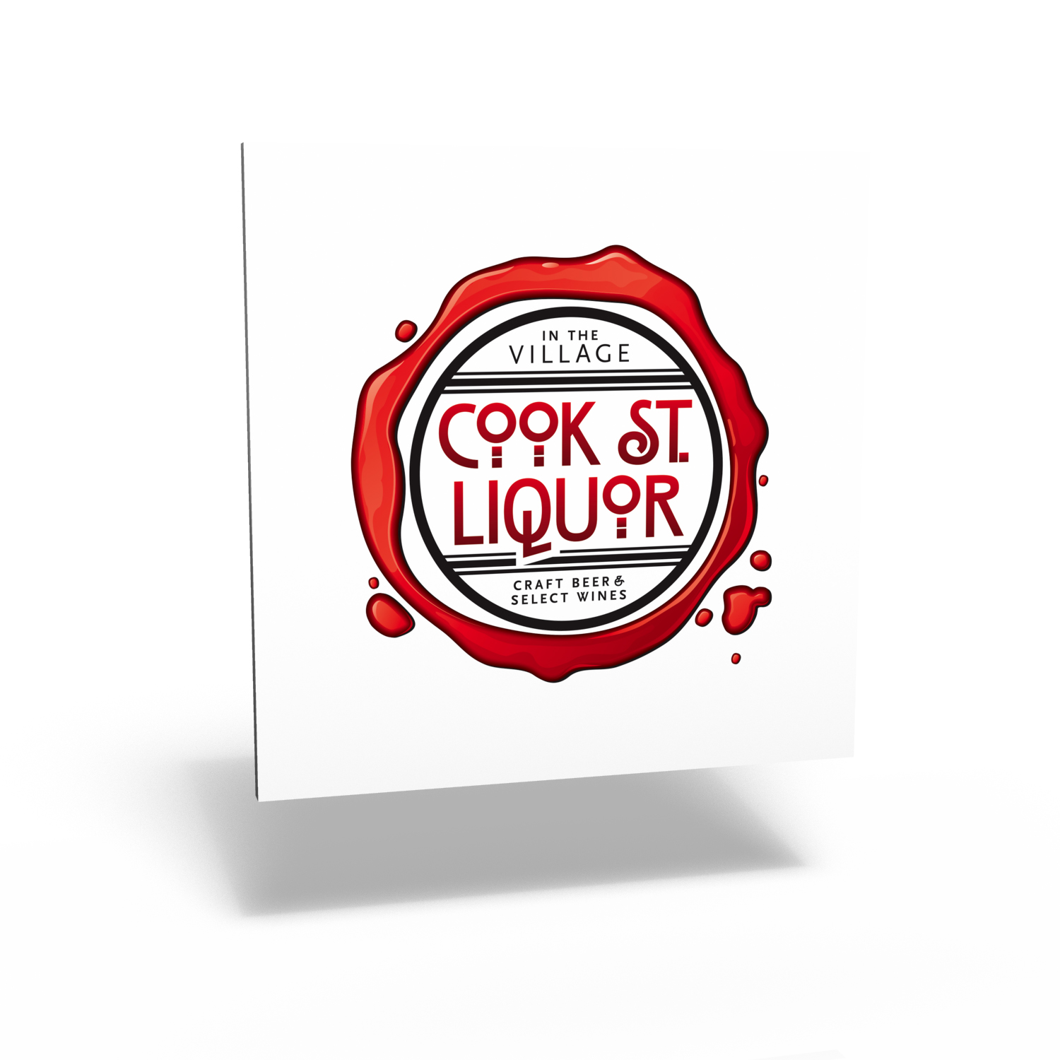
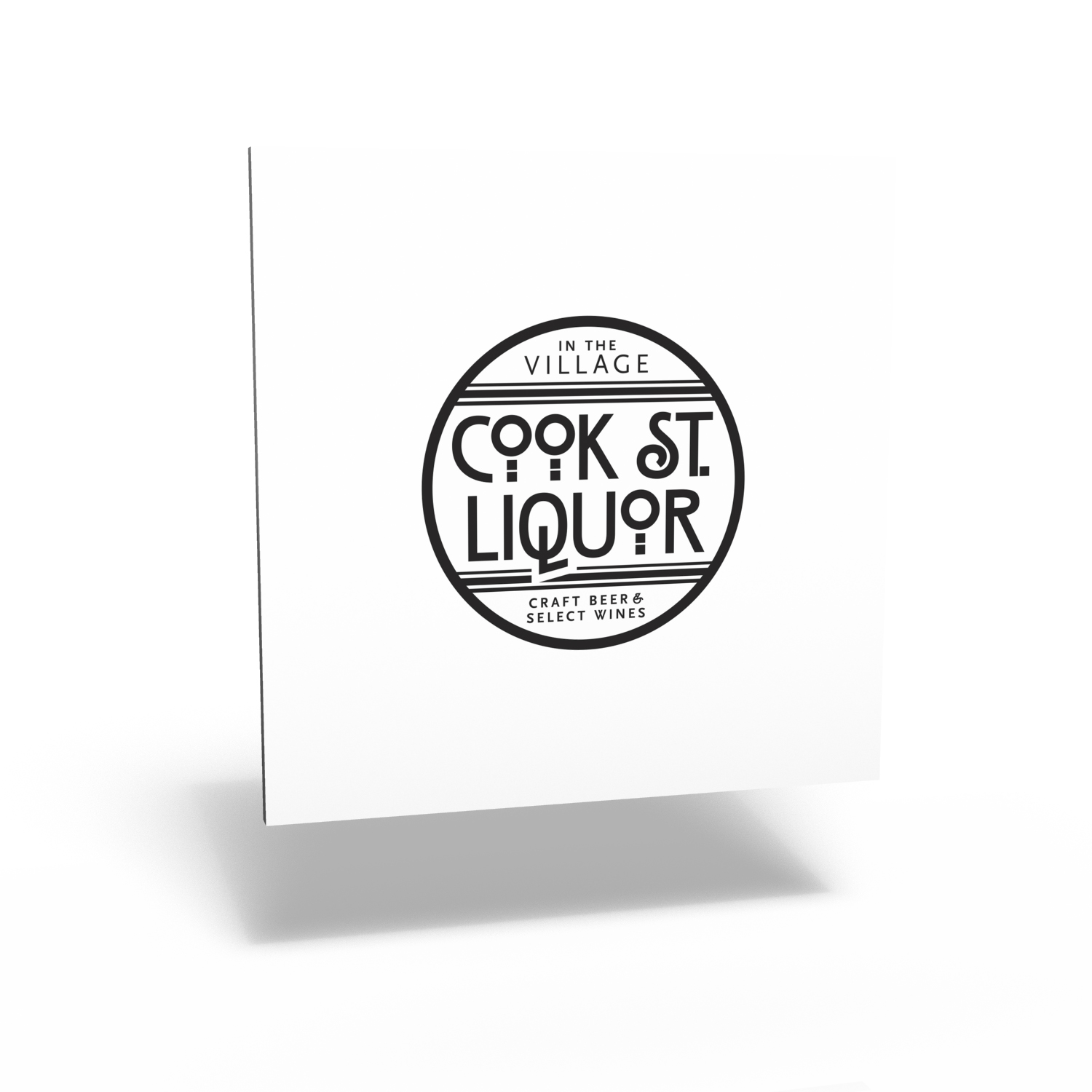
One of the challenges was working with the existing wordmark — the client wanted to keep the same typeface and basic layout so that retail signage could be retained — but at the same time modernize a bit and make the logo stronger. We suggested creating a logo family with a strong central element that remains unchanged, set into two different badges like this: the client can pick the logo depending on their target audience.
Comments
The new logo has been personalized for different markets — their great craft beer selection can be emphasized for music audiences at the Rifflandia festival, for instance, and specialty wines in display advertising in glossy magazines.